Monday, March 18, 2013

Worlds of AETHER final - process

Worlds of AETHER final - process

Materials:
- water color paper
- water colors
- copic markers
- salt

First inked:


Original Worlds of AETHER. Photo by Stephanie M. 17 March 2013. 

First painted/colored:


Second Orginal Worlds of AETHER. Photo by Stephanie M. 17 March 2013. 

Second round of color after dried: 


Colored Original Worlds of AETHER. Photo by Stephanie M. 17 March 3013. 

Worlds of AETHER color draft

Worlds of AETHER Color Draft

Below is the rough color sketch to generate the idea of how the final may look and how to incorporate design elements into this. 

The focal point/emphasis is the girls together in the center of the cover. Normally in design the center would not necessarily be the best focal point area, but using the model of the video game covers researched - the center of the picture seemed to be widely used. 

The colors in Sandara and CL's clothes are a combination of complementary colors that make them stand out to the eye. 

The values of the girl's outfits are very bold, where the design idea of the background would contrast by being light. 


Worlds of AETHER color draft. Photo by Stephanie M. 17 March 2013. 

Princess Design Sketches

'Princess' Design Sketches 

The chosen topic was the 'princess' design cover idea. The characters Sandara and CL, below, are roughly sketched to understand their mannerisms, body proportions, and get an idea of how they would pose on the cover. 

Sandara and CL character sketches. Personal sketches by Stephanie M. 17 March 2013. 


Design Problem Timeline

Design Problem Timeline

This is the originally created timeline for monitoring work progress:


Notebook Timeline. Personal sketch by Stephanie M. 17 March 2013. 

To make this easier to understand/read - the timeline has been fixed below:


Design Problem - 3 sketches

Design Problem - Rough three sketches

The three sketches below:


Three sketches for game covers. Personal sketch by Stephanie M. 17 March 2013. 


Design principle: Emphasis and Focal Point (contrast and placement?)

Design elements: Color (complementary/emotional?)
                                   Value (emphasis/contrast?)


1. One idea was to have a spy game where an androgynous (most likely female, but making it not a main focus) character who travels the world attempting to become a master of disguise and has to learn about places and people in order to do so.  


2. The second idea was to have a very normal girl (a more realistic looking girl to promote body image) strive to protect her friend using her book smarts to save the day. Tentatively, it would be about fairies and would involve research on folklore and things such as flowers and herbs. The main character is very curious, head-strong and loves books.


3. The third idea was to have a fantasy adventure type game where the main character is a girl questing across the lands with her best friend saving innocents, fighting ‘monsters’, and looking for the mysterious floating castle.


Out of these three concepts it boiled down to two:
- make an androgenous character and focus on a neutral character both genders could like
- make a more positive feminine character, but risk losing the male audience.

For the purpose of the design problem, the princess design was chosen in order to focus more on a positive and obvious female main character. 

Design Problem Research

Design Problem Research

The original design problem was to create a game for women who play or want to play video games in a teenage and up age group without losing too many male players, but to keep the female main character a positive model for women. It seems that this is not as easy a premise as it sounds to be. 

Here is a personal game collection and it has singled out games played in two categories. 

Games that give a chance of playing a female character:
My games. Photo taken by Stephanie M. 17 March 2013. 

Games that have a female main character:

Final Fantasy 10 game. Photo taken by Stephanie M. 17 March 2013. 

The results were 7 to 1. 

Online research for the concept:

An article by Becky Chambers written in November 2012 titled: "Why Games With Female Protagonists Don't Sell, and What it Says About the Industry." The link to the article can be found here: http://www.themarysue.com/why-games-with-female-protagonists-dont-sell-and-what-it-says-about-the-industry/. According to her, EEDAR (or Electronic and Entertainment Design and Research) conducted a study in 2012 where out of 669 games, 300 gave an option to play a female character and of these games, only 24 games had a female only protagonist. This is shocking, perhaps, but the video game industry feels making female-only games is risky. Chambers writes, "Zatkin found that female-led games received roughly 40 percent of the marketing budget as male-led games." She goes on to reveal the reasoning for this is simply that the game industry is afraid games with female leads will not make a profit. 


Design Problem Inspiration

Design Problem Inspiration

The game below is an older role playing game for GameCube called Tales of Symphonia. This game cover design was chosen as an inspiration for the final cover design. The colors are bright and eye-catching and the faded monochromatic background really makes the characters pop out. The characters themselves are softer and may appeal towards a feminine demographic, which is a wanted aspect for the design problem. 

Namco. "Tales of Symphonia." Amazon.com: : Video Games. N.p., n.d. Web. 17 Mar. 2013. http://www.amazon.com/Tales-Symphonia-Gamecube/dp/B0001OK7VW


Sunday, March 17, 2013

Design Problem

Design Problem:

To create a video game cover design/teaser that appeals more towards a feminine demographic. The ใƒŠใƒณใ‚ณใ‚ณ (nankoko) original design problem was to create a game for women who play or want to play video games in a teen+ age group without losing too many male players, but to keep the female main character a positive model for women. The Nankoko company wishes to expand their base demographic and believes by targeting a female audience they can eventually increase their profits. 

Why?

Women are an understated demographic in video game design and it is a field that deserves more time and study. There are very few games in the industry that have female main characters in the story and even fewer of those games have what could be seen as a positive female lead. The very first female lead character in a game was Samus Aran from Metroid made in 1986. It has to be noted;however, that Samus' gender was not revealed until the very end of the game. 
CVG Presents. "Samus Aran - the Bounty Hunter's Weapons." Wii Preview: Gameplay Preview. N.p., 28 May 2010. Web. 17 Mar. 2013. http://www.computerandvideogames.com/248810/previews/samus-aran-the-bounty-hunters-weapons/


Designer Statement

Designer Statement

I am a twenty-four year-old woman who believes in the power of imagination. I have created stories and worlds for myself and my friends ever since I was a child and now I am embarking on a journey to share those places with others. It is never too late to fall in love with stories that capture the imagination, give new ideas, and free the mind into a world of unlimited possibilities. 

Wednesday, March 13, 2013

Rhythm

Rhythm in art is about evoking the senses with a visual sensation. The three main ways rhythm is demonstrated in art is through visual rhythm, alternating rhythm, and progressive rhythm.


Visual Rhythm

Visual rhythm is clear repetition that is either perfectly replicated or only slightly modified. In the picture below from Kingdom Hearts, the windows are each exactly the same and repeat in a consistent repetition. 


MAT. "PlayStation 2Kingdom Hearts." Kingdom Hearts Screenshots for PlayStation 2. N.p., n.d. Web. 30 July 2003. http://www.mobygames.com/game/ps2/kingdom-hearts/screenshots/gameShotId,48487/


Alternating Rhythm

Alternating rhythm is a repetition that alternates regularly so that a pattern is seen. As in the Tales of Vesperia screenshot below, the player can only see a portion of the floor tiles, but they still would be able to understand that the pattern of light grey and dark grey squares will continue to alternate and the dark grey and yellow triangles will also continue around the circle. 


"Xbox360Achievements.org - Tales of Vesperia Screenshot 2 of 8." Xbox360Achievements.org - Tales of Vesperia Screenshot 2 of 8. N.p., n.d. Web. 13 Mar. 2013. http://www.xbox360achievements.org/game/tales-of-vesperia/showimg-2/


Progressive Rhythm


Progressive rhythm is a shape whose color, value or texture changes, but where the shape remains consistent. Like in the picture below of the chocobos, the birds all are the same, but their colors change. 


"Final Fantasy XI Screenshots (X360)." GameSpy: Screenshots (X360) 2381627. N.p., 1 May 2008. Web. 13 Mar. 2013. http://xbox360.gamespy.com/dor/objects/748456/final-fantasy-xi/images/final-fantasy-xi-20080501003026043.html

Wednesday, March 6, 2013

Balance


Balance in a composition is how the weight is placed. Three types of balance include: imbalance, bilateral symmetry, and asymmetrical balance. 


Imbalance

Imbalance in art is when the parts of a composition are not in proper balance. Usually in a composition, there is more weight towards the bottom, but this is not seen with this screenshot from Kingdom Hearts. Here, the Genie is much larger in comparison with Sora and makes the top part of the picture heavier. This weight switch creates an excitable kind of tension for the player. 

"Kingdom Hearts 1.5 HD ReMIX Screenshot for PS3." VideoGamer.Com. N.p., n.d. Web. 06 Mar. 2013. http://www.videogamer.com/ps3/kingdom_hearts_15_hd_remix/screenshot-4.html


Bilateral Symmetry 

Bilateral symmetry can basically be explained as a mirror image. This picture of Sophie is a close shot of her face and if you divide her face into two halves, each side looks like a mirror image. It also gives her a very innocent appearance. 


"Tales of Graces F Photo Gallery - G4tv.com." G4tv.com. N.p., 11 May 2011. Web. 06 Mar. 2013. http://www.g4tv.com/images/4129/screenshots-tales-of-graces-f/68262/


Asymmetrical Balance

Asymmetrical balance is when on either side of the axis there are different amounts of weight, but they both balance each other out. In this screenshot from Tales of Graces F, the screen can be split into two halves and on one side there are three girls who appear small due to distance and on the other is one depressed looking boy who is larger due to close proximity. It is unequal, but still balances out. 

"'Tales of Graces F' Screenshot - Gaming Review: Tales of Graces F - Digital Spy." Digital Spy. N.p., n.d. Web. 06 Mar. 2013. http://www.digitalspy.com/gaming/i429921-8/gaming-review-tales-of-graces-f-tales-of-graces-f-screenshot.html


Scale and Proportion


Scale and proportion both are terms used for size. Scale defines how large or small an object is and proportion is how an object is measured compared to the standard. Three ways to examine size and proportion in gaming is by looking at scale and proportion for emphasis, human scale reference, and the golden rectangle. 


Scale and Proportion for Emphasis

Scale and proportion create a center of emphasis in a composition. In this case from Kingdom Hearts, the massive scale of the evil genie is emphasized by the tiny buildings below and the boy Sora flying on his magic carpet. 

Tiflojet. "Screenshot #001 from Kingdom Hearts II." Screenshot #001 from Kingdom Hearts II. N.p., 10 July 2006. Web. 06 Mar. 2013. http://www.gamersglobe.co.uk/screenshot/kingdom-hearts-ii-ps2-001


Human Scale Reference

Using human scale reference means to compare size in a composition with that of humans. Just like in the picture below we see a statue and in front of it is Sora, from Kingdom Hearts. Had this picture not had Sora standing underneath the statue, it would be difficult for the viewer to figure out exactly what size the statue might be, but in relation with Sora, it is more clear just how much bigger it is in comparison with human size. 


"Kingdom Hearts RE: Chain of Memories Screenshots (PS2)." GameSpy: Screenshots (PS2) 2667124. N.p., 2 Dec. 2008. Web. 06 Mar. 2013. http://ps2.gamespy.com/dor/objects/14282207/kingdom-hearts-re-chain-of-memories/images/kingdom-hearts-re-chain-of-memories-20081202074023659.html


Golden Rectangle

The golden rectangle is what the Greeks considered the perfect proportion for rectangles which is width is to length as length is to length plus width. This picture from Tales of Graces F shows how the golden rectangle can be seen in video games as well as art. 

Romano, Sal. "Tales of Graces F Screenshots - Gematsu." Gematsu Tales of Graces F Screenshots Comments. N.p., 17 Apr. 2012. Web. 06 Mar. 2013. http://gematsu.com/2012/04/tales-of-graces-f-screenshots-3 


Sunday, March 3, 2013

Emphasis and Focal Point


Through the use of emphasis and focal point the artist can catch someone's attention. Three ways to utilize this is emphasis by contrast, emphasis by isolation, and emphasis by placement. 


Emphasis by Contrast

By contrast means there is a difference between two parts of the composition that really pops out to the viewer. In the picture below, the area outside the circle is dark and murky colored, while inside the circle Raine has cast is very light and immediately finds the player's attention. 

Shaorina. "Sharpness - Tales of Symphonia Screenshot." Sharpness - Tales of Symphonia Screenshot. N.p., Jan. 2013. Web. 03 Mar. 2013. http://stuffpoint.com/tales-of-symphonia/image/166178/sharpness-screenshot/


Emphasis by Isolation


By isolation, the element is emphasized by being alone. As an extreme example, the man below is immediately easy to focus on due to his being entirely alone and walking in a desert. 
Helgeson, Matt. "GameInformer." Gameinformer. N.p., 24 Oct. 2011. Web. 03 Mar. 2013. http://www.gameinformer.com/games/uncharted_3_drakes_deception/b/ps3/archive/2011/10/24/uncharted-3-rev-dummy.aspx

Emphasis by Placement

By placement, the viewer's attention is focused on the item that is placed methodically in a composition, often in the center. In the center of this picture from Ni no Kuni, the plate of cheese  that is emphasized by the struggle between the two characters pulling at the plate. 

"New Screenshots Emerge From Ni No Kuni." DIY. N.p., 10 July 2012. Web. 03 Mar. 2013. http://www.thisisfakediy.co.uk/articles/games/new-screenshots-emerge-from-ni-no-kuni/P6/

Unity


Unity is essential in art. It is the harmony that exists in a composition. Three ways to achieve unity are by use of proximity, repetition, and continuation. 


Proximity

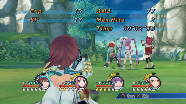
Proximity is easily described as nearness. The eye is drawn to the proximity of objects and sees them as a whole before it sees them separately. In the picture below from Tales of Symphonia, the five characters are standing close together in the center of the picture. The viewer first sees the group together and then is able to distinguish each character. 


Shaorina. "Eew - Tales of Symphonia Screenshot." Eew - Tales of Symphonia Screenshot. N.p., Feb. 2013. Web. 03 Mar. 2013. http://stuffpoint.com/tales-of-symphonia/image/175080/eew-screenshot/


Repetition

Repetition is an element that recurs over and over. Sheena, from Tales of Symphonia, is surrounded by lines of cards in the air that repeat over and over in a consistent pattern. 


Shaorina. "Sheena - Tales of Symphonia Screenshot." Sheena - Tales of Symphonia Screenshot. N.p., Jan. 2013. Web. 03 Mar. 2013. http://stuffpoint.com/tales-of-symphonia/image/166356/sheena-screenshot/


Continuation


Continuation is a line that allows the eye to move continually from one area to another. The lines of the rocks above the boy flow to the line of the bridge and onto the next rock, allowing the viewer to see everything very smoothly. 


Emanuele. "Wind Of Change [The Adventure Begins]." Electric Blue Skies RSS. N.p., 28 Feb. 2013. Web. 03 Mar. 2013. http://www.electricblueskies.com/portfolio/nintendo-emulation-dolphin/the-legend-of-zelda-the-wind-waker/and-so-the-story-begins/ 

Wednesday, February 27, 2013

Color

Color is vitally important in art and design. It has a wide variety of ways in that it effects video games as well.  No video game would be successful without the correct colors chosen to reflect its design. Three color types that can be observed are with cool colors, warm colors, and triadic colors. 

Cool Colors

Cool colors are defined as colors on the color wheel that are closer in hue to blue. These cool colors are associated with specific emotional feelings. In the picture below a deep blue pervades the scene of Yuna crying in this emotional scene in Final Fantasy 10. Blue is a color often associated with the feeling of sadness, which is why this cool color intensifies her impending self-sacrifice. 

Emanuele. "Macalania Revisited | Boy Kisses Girl under the Moonlight." Electric Blue Skies RSS. N.p., 6 May 2012. Web. 27 Feb. 2013. http://www.electricblueskies.com/portfolio/final-fantasy-x/macalania-revisited-boy-kisses-girl-under-the-moonlight/


Warm Colors

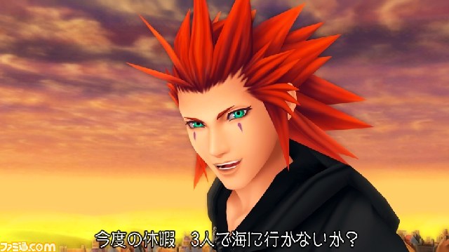
Warm colors are composed of the colors around red on the color wheel. Axel, from Kingdom Hearts 2, is seen below surrounded by the warm colors present in the sunset behind him. These colors are associated with this heart-warming scene of friendship and give the viewer a sense of happiness that the characters in the story felt at this time. 


Joey. "Tetsuya Nomura Interview HD Screenshots! - News - Kingdom Hearts Insider." Tetsuya Nomura Interview HD Screenshots! - News - Kingdom Hearts Insider. N.p., 4 Oct. 2012. Web. 27 Feb. 2013. http://www.khinsider.com/news/Tetsuya-Nomura-Interview-HD-Screenshots-3097


Triadic Colors

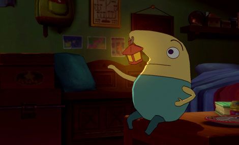
Triadic colors are colors on the color wheel that are separated by three colors. There are different sets of triadic colors in the triadic color scheme and one of those sets are made of blue, red, and yellow. An example of this set of colors is Mr. Drippy, the fairy from Ni no Kuni. His body is made of blue and yellow, while his lantern/nose is made of red and yellow.

Williams, Ed. "Ni No Kuni: Wrath Of The White Witch." The 405. N.p., 30 Jan. 2013. Web. 27 Feb. 2013. http://thefourohfive.com/review/article/ni-no-kuni-wrath-of-the-white-witch


Value

Value in art is the term for a color's lightness or darkness. Light in relation to video games can be seen in various terms such as: achromatic, chiaroscuro, and value emphasis.


Achromatic

The term achromatic refers to being without color. Not many video games are created in black, white and grey and Epic Mickey is an unusual exception. In this part of the game, the original world of Mickey Mouse can be explored in all of its achromatic beauty, just as it is seen below. 

Riley Little. "'Epic Mickey'€™ Hands-On Preview." Game Rant. N.p., 17 Oct. 2010. Web. 27 Feb. 2013. http://gamerant.com/epic-mickey-preview-demo-riley-46405/


Chiaroscuro 

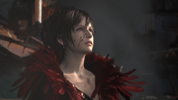
Chiaroscuro is a term that is used to describe depth created by the combination of light and dark. The figure that is show below is clearly outlined and feels much closer to the screen than the background which is so bright that it feels very far away. 

Romano, Sal. "Square Enix Reveals Next-gen Final Fantasy Tech Demo - Gematsu."Gematsu Square Enix Reveals Nextgen Final Fantasy Tech Demo Comments. N.p., 5 June 2012. Web. 04 Mar. 2013. http://gematsu.com/2012/06/square-enix-next-gen-final-fantasy-tech-demo


Value Emphasis

Value emphasis is when light and dark combine in order to bring the eye directly to an area of emphasis. This picture is encompassed in darkness except for one bright flashlight which in combination allows the zombie figure in the center to pop out as a very strong focal point. 

Emanuele. "'€œBooh'€." Electric Blue Skies RSS. N.p., 21 Jan. 2013. Web. 27 Feb. 2013. http://www.electricblueskies.com/portfolio/doom-3/booh/

Sunday, February 24, 2013

Illusion of Motion


Art is a reflection of life and life is constantly moving - therefore motion is an important element of art. Some types of motion that can be experienced in a video game include: anticipated movement, lines of force, and kinesthetic empathy. 


Anticipated Movement

Anticipated movement is defined as the motion a viewer thinks will happen given their own  past experiences with the subject matter. In Lollipop Chainsaw, for example, we see the main character swinging a chainsaw at a zombie. We, as the viewer, can assume this motion will be completed with her sawing the zombie and his falling to the ground. 

Ashcraft, Brian. "Lollipop Chainsaw Reveals Skimpy Outfits." Kotaku Australia, the Gamer's Guide. N.p., 9 Mar. 2012. Web. 23 Feb. 2013. http://www.kotaku.com.au/2012/03/lollipop-chainsaw-reveals-skimpy-outfits/


Lines of Force

Lines of force are well used to strongly suggest the feeling of motion and where the motion is going. Lines of force are widely used in video games, as demonstrated below. The warrior is swinging his weapon and the lines used to show the pathway of his weapon and really enhance the motion are clearly seen below the jumping man. 


Simmonds, Murphy. "Games Reviews Final Fantasy XIII-2, Soul Calibur V, Resident Evil: Revelations." Leeds Guide Articles RSS. N.p., 8 Feb. 2012. Web. 23 Feb. 2013. http://www.leedsguide.co.uk/review/games-reviews/final-fantasy-xiii-2-soul-calibur-v-resident-evil-revelations/20232


Kinesthetic Empathy 


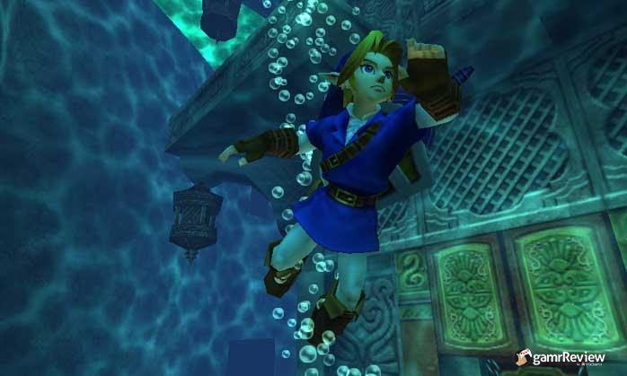
Kinesthetic empathy is motion an observer feels when looking at a work of art. Legend of Zelda's hero, Link, is seen here swimming underwater with bubbles rising towards the surface. Seeing someone swimming underwater can evoke a feeling in the player that reminds them of what it feels like to hold their breath and float in the water. 

Share-Strom, Daniel. "The Legend of Zelda: Ocarina of Time 3D - Review." - GamrReview. N.p., 18 June 2011. Web. 23 Feb. 2013. http://www.gamrreview.com/review/86879/the-legend-of-zelda-ocarina-of-time-3d/

Illusion of Space


The illusion of space is found in all forms of art. The viewer can experience these various feelings of depth and space in a two-dimensional or three-dimensional plane depending on the type of art they are observing. Three concepts of space that can be observed from video games are open form, one-point perspective, and aerial perspective. 


Open Form

Open form is when the elements in the picture are cut off so that the viewer is only able to see what seems to be a portion of the full scene. In the Final Fantasy scene below, we can see a young girl interacting with a creature called a Moogle, but we cannot see everything that is going on outside the frame. Their bodies are cut off, but we still can know that other things are happening outside of this limited viewpoint. 


Duine, Erren Van. "New FINAL FANTASY XIII-2 Screenshots Return to Yaschas Massif." Nova Crystallis. N.p., 22 Aug. 2011. Web. 23 Feb. 2013. http://www.novacrystallis.com/2011/08/new-final-fantasy-xiii-2-screenshots-feature-serah-farron/


One-Point Perspective

The one-point perspective is directly parallel or perpendicular to the viewers eye-line where lines come together on a single point (vanishing point) that is on the horizon. The vanishing point in this case can be seen behind the running girl from Atelier Meruru. 


Kollar, Phil. "The Year of the RPG?" Gameinformer. N.p., 29 Dec. 2011. Web. 23 Feb. 2013. http://www.gameinformer.com/b/features/archive/2011/12/29/the-rpgs-of-2012.aspx


Aerial Perspective


Aerial perspective is when the colors in the background of the picture become blurry or washed out so that they look like they are part of the atmosphere. Ni no Kuni's landscape in the picture below illustrates this aerial perspective. The ground closer to the viewer's eye is distinctly easier to see in contrast to the areas farther back which have a blue, foggy quality due to the atmosphere obstructing the colors the eye can see. 


HelenBaby. "Eurogamer 2012 : Ni No Kuni: Wrath of the White Witch." Plus XP RSS. N.p., 13 Oct. 2012. Web. 23 Feb. 2013. http://www.plusxp.com/2012/10/eurogamer-2012-ni-no-kuni-wrath-of-the-white-witch/


Wednesday, February 20, 2013

Pattern and Texture


Pattern is a series of repetitive designs that are either simple or complex. Texture is similar to pattern, but it appeals directly to the sense of touch. 

Pattern

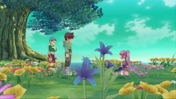
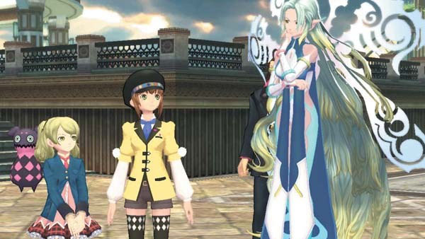
Pattern, as is stated above, is a sequence of repeated designs. Behind the characters from Tales of Xillia 2 is a fence made up of several repeating simple patterns that frames the scene and the sky. 

Slayton, Olivia. "Tales of Xillia 2 Has Special Order System, 100 Cats to Find - Gematsu." Gematsu Tales of Xillia 2 Has Special Order System 100 Cats to Find Comments. N.p., 9 Oct. 2012. Web. 21 Feb. 2013. http://gematsu.com/2012/10/tales-of-xillia-2-has-special-order-system-100-cats-to-find 


Visual Texture

Visual texture is an illusion that suggests a tactile quality despite not having actual realistic texture. In the picture below from Secret of Mana,the trees and foliage give us a sense of actual texture, despite it not actually having any. 

GamesRadar. "28 of the Most Favourite Video Game Trees Ever." Page 2 -. N.p., 23 June 2011. Web. 21 Feb. 2013. http://www.gamesradar.com/28-of-the-most-favourite-video-game-trees-ever/?page=2

Textural Variety


Textural variety is a varied texture that draws and keeps the interest of its viewers with its differences. It may seem odd to talk about textural variety when it comes to video games, but there is one video game in particular that has a very unique take on textural variety inside of a game. In Paper Mario, the designers worked to actually produce a game where the world sports a contrast between a normal game and the feeling of paper. In the image below, this contrast is seen where Mario and Toad are clearly made out of paper while their surroundings are not. 

Cubedgamers. "Paper Mario: Sticker Star Review รข€“ A Sticky Situation | Cubedgamers." Cubedgamers. N.p., 15 Dec. 2012. Web. 27 Feb. 2013. http://www.cubedgamers.com/home/2012/12/15/paper-mario-sticker-star-review-a-sticky-situation/